This is the platform.
Not a mock-up.

Every screen below is captured from the running AMI platform — live dashboards, real numbers, no illustrations. Three products — ATM, Cards and Cash — from per-ATM P&L to portfolio economics to the cost of cash. Click any screen to view it full size.

Know what every machine earns

Transaction analytics and a four-level P&L for every ATM in the estate — so the question "is this machine worth keeping?" has an answer, not an opinion.
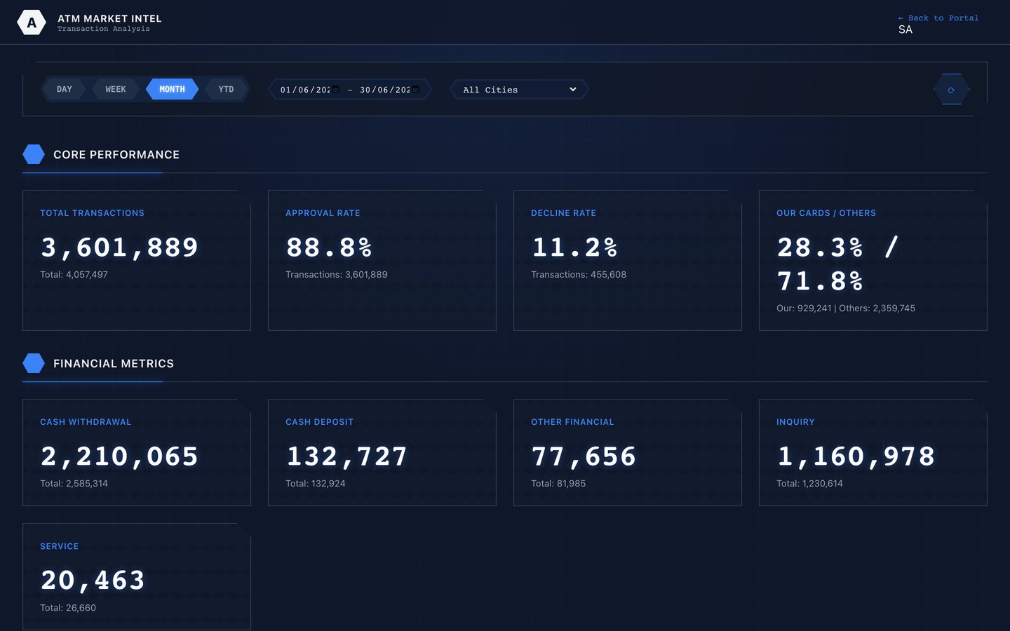
ATM KPI dashboard showing total transactions, approval rate, decline rate and cash withdrawal volumes

Network performance at a glance

Millions of transactions, approval and decline rates, and your-cards-versus-others split — current, every day.
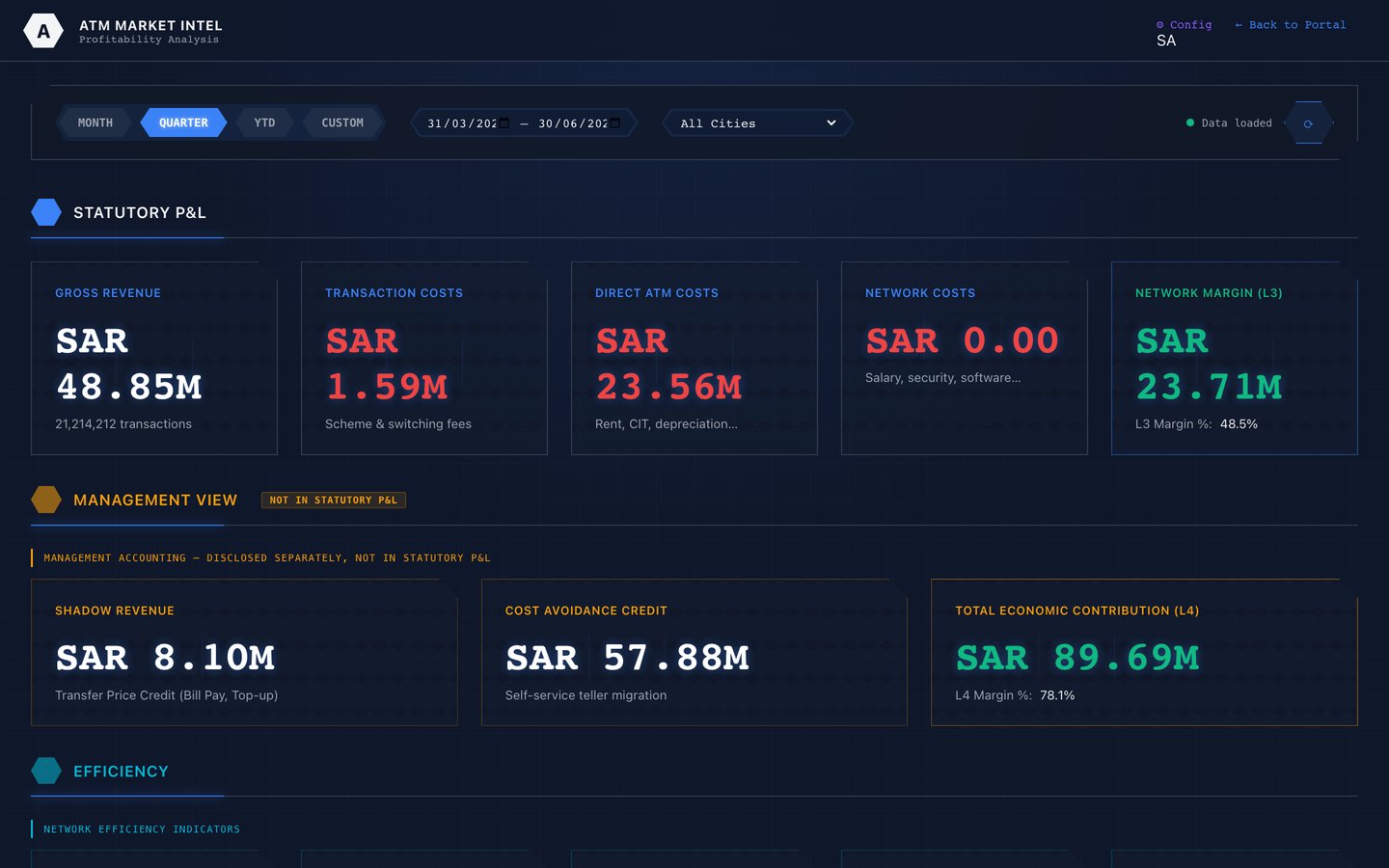
Per-ATM profitability dashboard showing revenue and cost breakdown across the estate

Four-level P&L, per machine

Revenue, direct cost, allocated cost and contribution — the machines that earn and the ones that bleed, ranked.
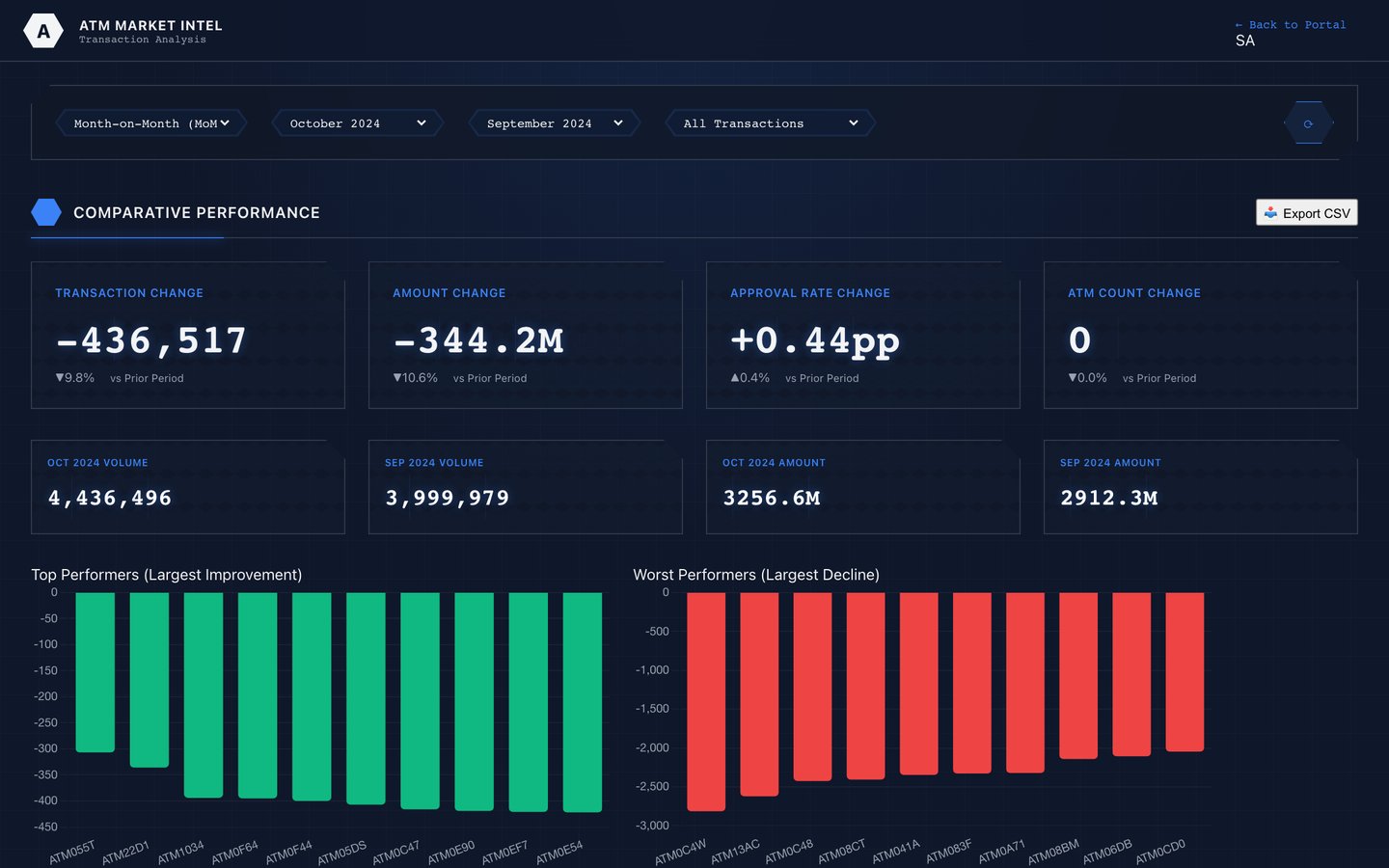
Month on month transaction shift analysis with per-ATM gain and loss bars

Catch demand moving early

Month-on-month shifts per ATM, so a site in decline surfaces long before it shows up in the annual review.
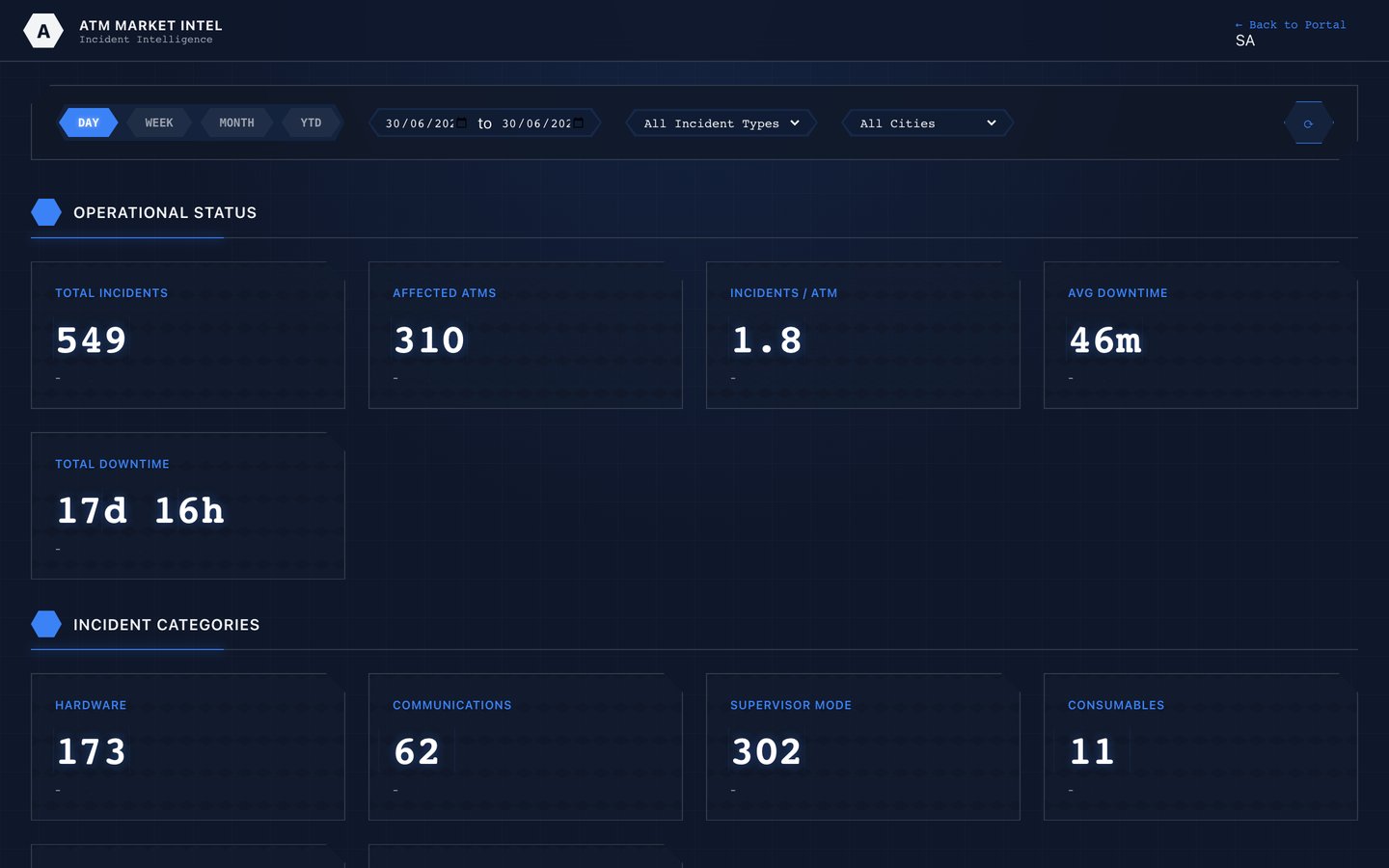
ATM incident dashboard with fault categories and downtime metrics

Faults triaged automatically

Outages, component failures and downtime categorised from the journals — your team acts on signals, not surprises.
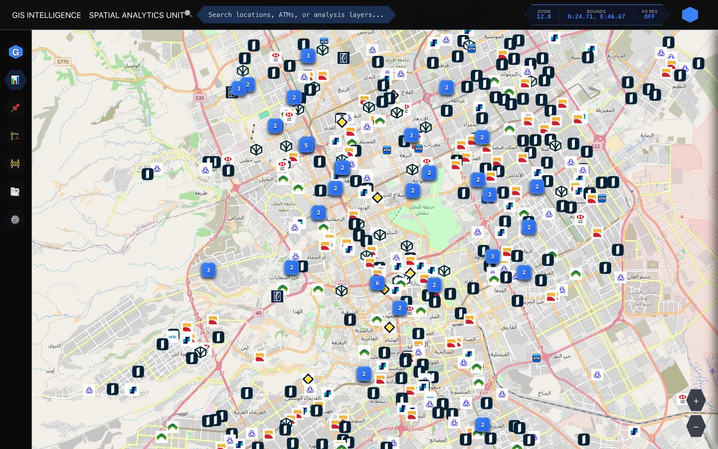
Every ATM on the map. Yours and theirs.

Spatial analysis over the whole market — hexagonal demand indexing, multi-criteria site scoring, and the competitive landscape your cardholders are already walking to.

Interactive GIS map showing ATMs and competitor locations across the city with clustering

See where you're losing transactions

Your estate and every competitor ATM on one live map — find where your cardholders withdraw from someone else's machine, and what that interchange is costing.

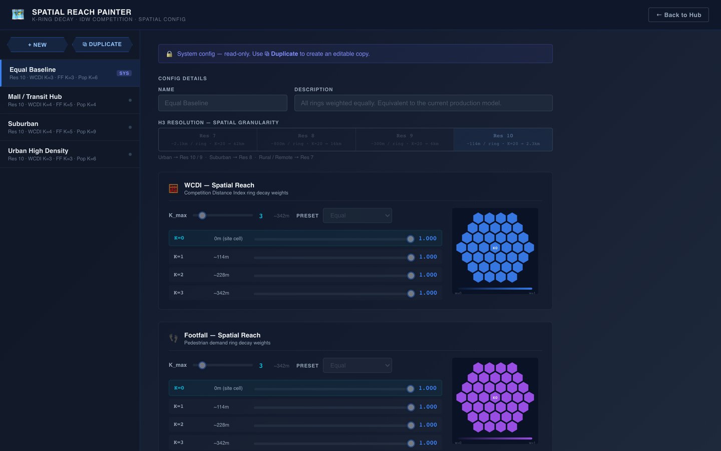
Hexagonal H3 spatial indexing configuration with demand cells

Geography, made comparable

Hexagonal indexing turns messy geography into demand cells you can score, rank and compare like-for-like.

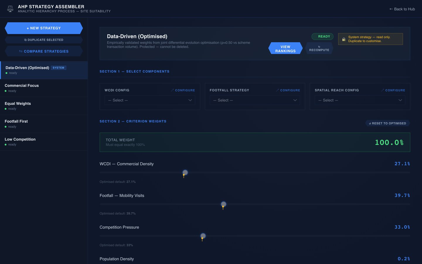
Multi-criteria AHP site scoring weights configuration

Scoring calibrated to your market

Multi-criteria weighting you can tune and defend — so a site score reflects your network, not a vendor's default.

The whole estate, on the record

Every machine, contract and SLA in one registry — including the competitor estate, so market share is a number rather than a guess.

Nationwide ATM registry with counts by bank and distribution charts

The national estate, counted

Every ATM in the market, by operator — your share, their share, and where the gaps are.

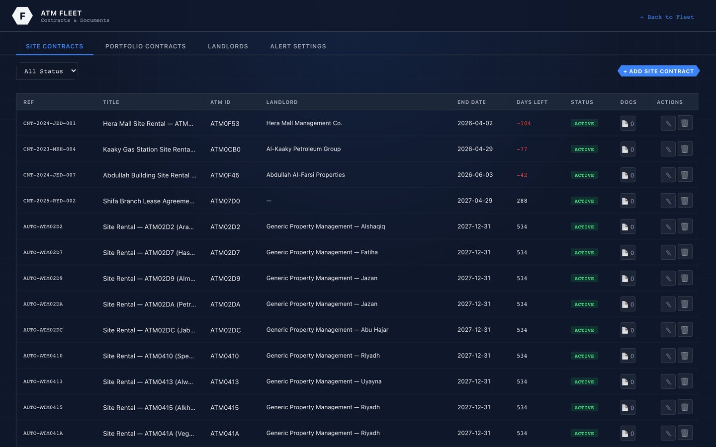
Fleet contracts and SLA tracking with expiry status

No contract expires by surprise

Leases, vendor contracts and SLAs tracked with expiry alerts — renegotiate on your timeline, not theirs.

See the full ATM tour →

Per-ATM P&L, site & competition, cash, forensics and fleet — 14 screens.

What cash actually costs you

Cash is the largest controllable cost in the network and the least measured. This makes it visible — branch to vault to regulator.

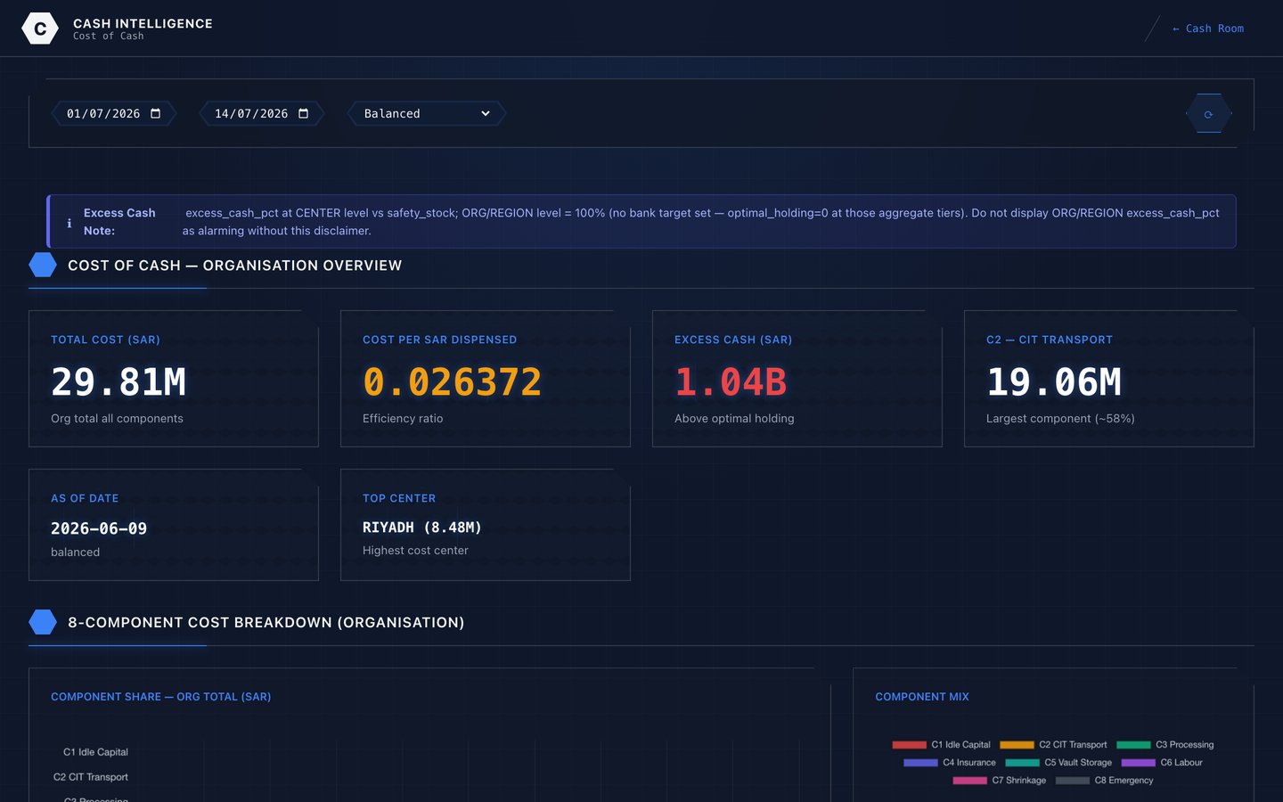
Cost of cash dashboard quantifying carry cost, CIT and idle balances

Cost of cash, quantified

Carry cost, CIT movements and idle balances turned into a number you can actually manage down.

Branch cash fleet dashboard showing balances and fleet health across branches

Every branch, one view

Balances, health and deviation across the branch network — overfunded sites and stockout risk side by side.

Cash command dashboard with position, movement and risk indicators

One command view

Position, movement and risk in a single operational picture — the daily cash decision, made in one place.

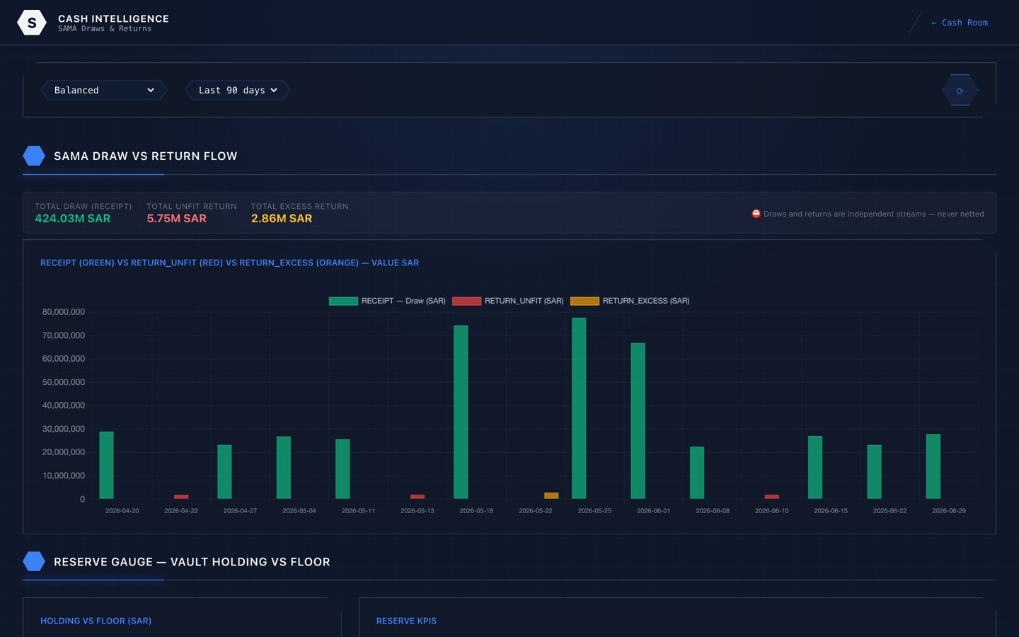
Central bank draws and returns dashboard with reconciliation trend

Regulator-ready by default

Central-bank draws and returns reconciled continuously — the audit trail is a by-product, not a project.

See the full cash tour →

Position, branch fleet, cost of cash, forecasting and the regulator — 14 screens.

Find the money already in the book

Portfolio analytics across credit, debit, prepaid, charge and corporate — plus an optimizer that turns the analysis into ranked, costed actions.

Unused capital cockpit ranking credit line rightsizing actions by value

Idle credit lines, ranked by value

Capital sitting unused on the book — every rightsizing action ranked by what fixing it is worth.

Rewards efficiency dashboard showing rewards spend and projected savings per account

Rewards that aren't buying loyalty

Where reward spend earns nothing back — and precisely what trimming it recovers, account by account.

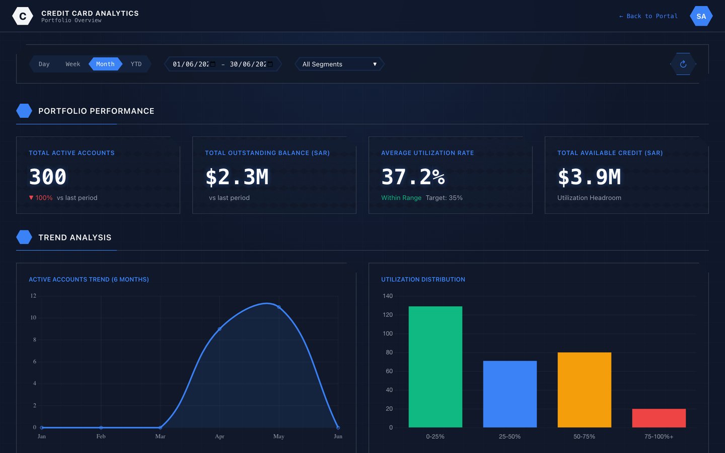
Card portfolio dashboard with account volumes, balances and utilisation trends

Portfolio performance, live

Accounts, balances, utilisation and trend across every card product in the book.

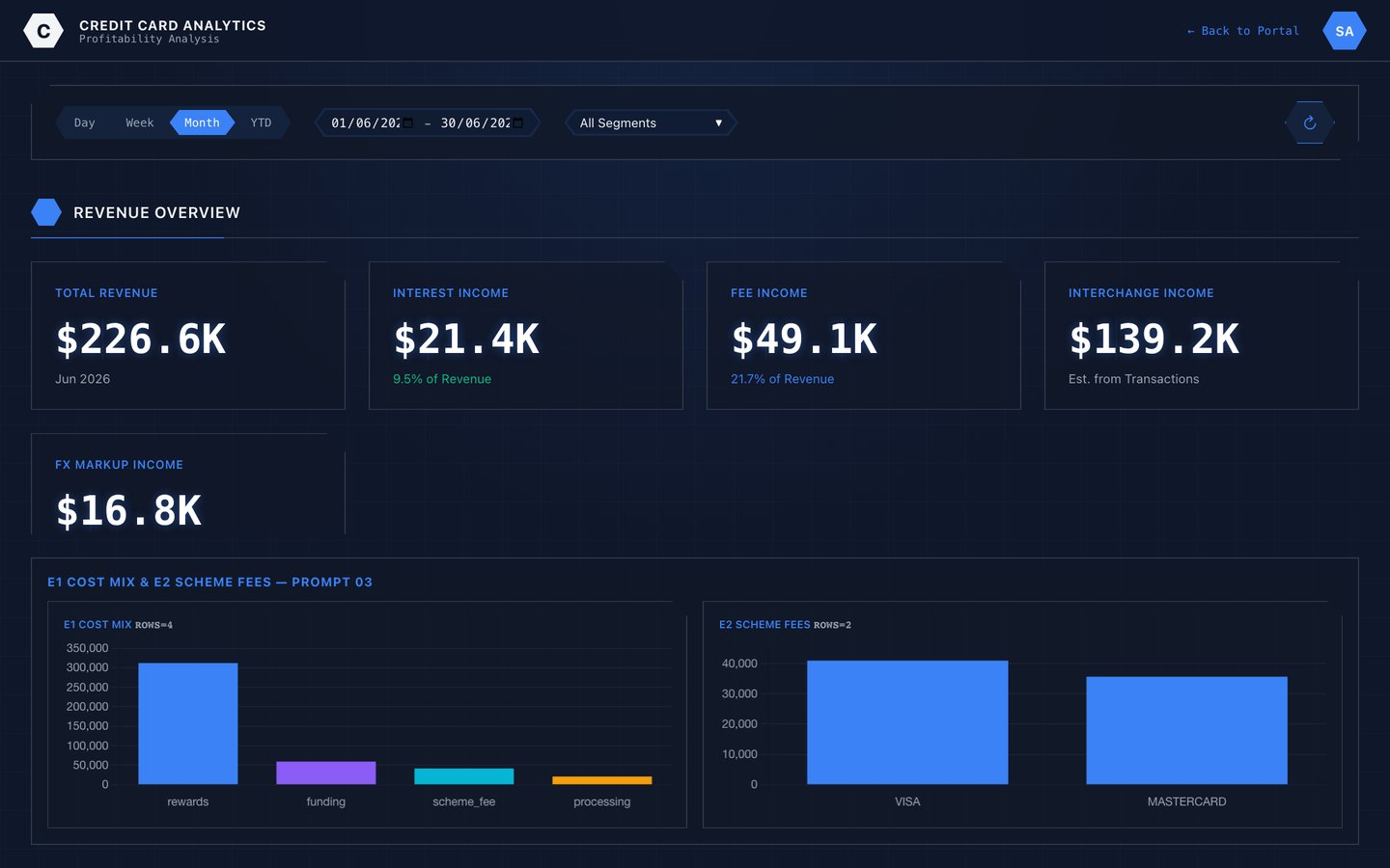
Card profitability dashboard breaking revenue down by component

Profit, decomposed

Interchange, fees, interest and cost per card and per segment — so pricing decisions have evidence behind them.

See all 25 card screens →

Credit, debit, prepaid, charge and corporate — the full card analytics tour.

The decisions are yours.
The intelligence is ours.

Want to see these screens running against your own operation? Start with a network review.

Live Demo Book a Meeting See the Business Case